Managing Your Data
Your Data Dashboard
Dashboard Overview
Your data dashboard provides the basic analytics about your company performance. You can choose to view managed entities (technicians, business units, job types) only, or you can view the entire data set analytics. 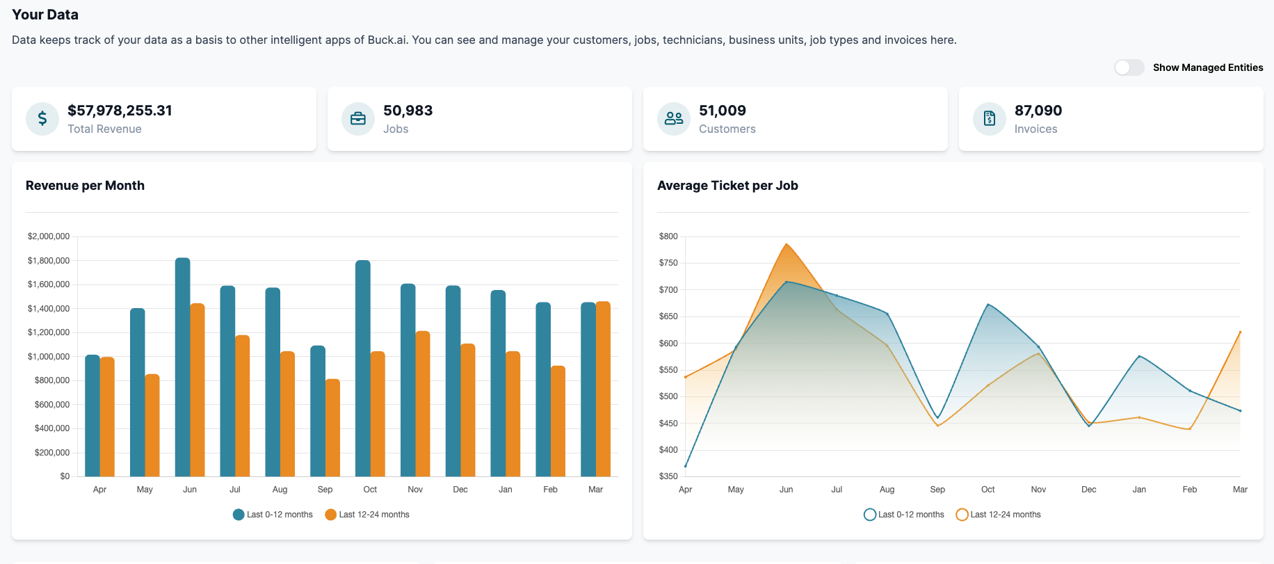
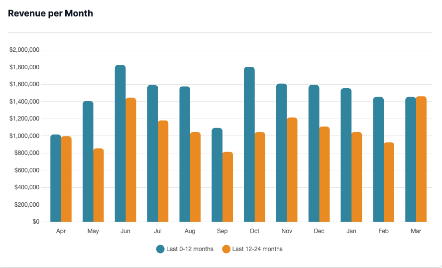
Revenue per Month
Revenue per month analytics shows your company revenue performance for the last two years, comparatively. You can click on the time frames at the bottom of the bar graph to change the timeframe.
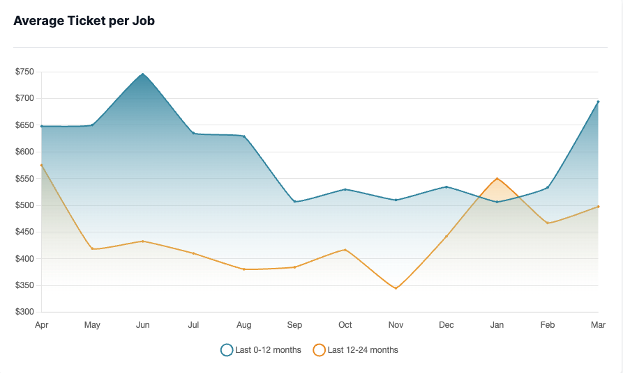
Average Ticket per Job
Average Ticket per Job shows your average revenue per job for the last 2 years, comparatively. Blue line shows your last 12 months, whereas the orange line shows 24~12 months before today.
Dashboard Widgets
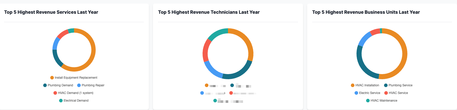
Buck.ai comes with several widgets as part of your dashboard. They show Top 5 Job Types, Technicians and Business Units by revenue for the last 12 months.